Saturday, September 29, 2007

C is for Cowboy


I like this card.

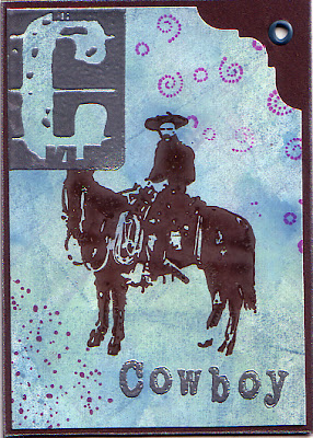
First I sponged a little bit of light yellow ink on glossy white cardstock. Then I sponged light blue ink over that. The inks were not bold enough, so I took up a blue gray pad and pressed it directly onto the paper. You can see a few lines from the edge of the pad, but I like them too. I used a magenta color ink to put in some swirls and spatters with Stampin' Up background filler stamps. The little spatter stamp is one of my favorites, and the first tool I reach for when the image needs a little something.

The vaquero stamp is by Acey Deucy. He is stamped with coffee archival ink over everything. I am still working on getting good coverage with solid area stamps, as you can see on the horse's chest, flank, and hip.

To add to the western feel of the piece, I trimmed the corner with a Fiskars Nostalgia Corner Edger, and hammered a blue gray eyelet into the open space of the brown stock.

I used silver embossing powder for the C and Cowboy. I think the silver, blue, and brown color work very well together. Lastly, I dragged the edges of the brown stock over a silver pigment pad.

B is for Bathing Beauties


This card looked better in my mind.

I wanted it to have a summer shore feeling, and thought that the baby wipe technique would give me the light sandy beach colors I imagined. For the baby wipe technique, you fold a baby wipe into a pad shape, then squeeze a few drops of ink from a reinker onto the edge. You then apply the inked edge to glossy card stock. Because the baby wipes are juicy, you can use them in a sweeping motion and draw them across your paper. It is a simple technique with lovely outcomes. I do like the background as it turned out.

Wish You Were Here is a great stamp for this card, but I think I should have colored in the beauties' bathing suits, and masked the skin so the image would have popped out of the background. I picked up the stamp on ebay, and I don't know the maker. It is a clear stamp that has yellowed over time, but still produces a good image.

I embossed the B and the words Bathing Beauties with Antiquities Rose Quartz. I thought the embossing would be more opaque. Now I know. The Rose Quartz is translucent and I think I will use it differently next time.

All in all, the card is light and watery.

Friday, September 28, 2007

A is for Astronomer with Astrolabe


The artist trading card alphabet is complete. I want to post all of the cards I made with a description of what techniques I used for each. I will include stamp credits when I can.

The A is for Astronomer with Astrolabe card uses polished stone technique, dye ink from PSX in indigo and Uptown Accessories Antique Gold embossing powder. I used a glossy white stock and cut it slightly smaller than the royal purple background card stock. I also dragged the edges of the card over a gold pigment pad for a little extra color.