Wednesday, October 31, 2007

DO NOT STARE


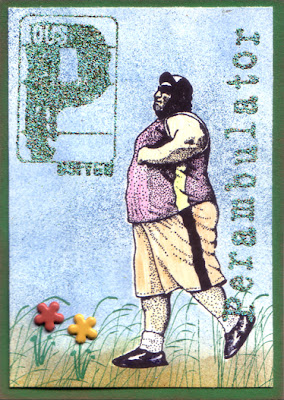
Taking a break from the Alphabet Soup cards to wish everyone a Happy Halloween.

Stamp credits for this card are: Bartholomew's Ink for the Brownie Witch and the Owl, and Stampfrancisco for Do Not Stare. I made the little thread line border using an old Stampin Up borders stamp, Perfect Plaids. "Halloween Wishes!" was stamped using the Making Memories magnetic Rummage alphabet. I stamped a big mustard moon by Norton Designs over it all.

Purple glitter around the lightest bit of card stock adds sparkle and picks up the other purples in the ink and paper. I don't do much with glitter, but I must love it - I have a big shoe box full of different glitters on the shelf and no one bought them FOR me! I need to find more reasons to use them.

Stampfrancisco has tons of interesting stamps and an easy to navigate catalog. If you are looking for stamps that are a little out of the ordinary, I recommend their store.

Monday, October 29, 2007

P is for Perambulator


I think this walking guy is fantastic. The stamp is marked Rubber Stamps of America, and so I thought it was a Ken Brown, but I don't find the image in the online store catalog. It really looks like a Ken Brown image, though. Maybe he is retired.

This card uses a masked image. I stamped the perambulator on white stock and also on a post-it note. I cut out the image on the post-it and placed it over the image stamped on the white card stock. Then, I sponged a variety of blue inks all over to create depth.

I sponged some mustard and browns near the bottom of the card, then stamped some grasses with a roller wheel across the bottom so it looks like he is walking on a grassy path.

I wanted to try adding a couple of flower brads, so I stamped a tiny plant bottom and then punched teeny holes to poke the brads through. I didn't like the brads the second I had added them, but it was too late. The holes and stems were already there.

I stamped the big P and the title Perambulator with Versamark ink so that I could emboss them with Verdigris embossing powder by PSX. I like the Verdigris powder because it has little metallic flecks in it, and comes out pebbly and rough when you heat it up. Tsukineko has a clear tutorial on using Versamark for embossing.

Wednesday, October 24, 2007

O is for Odd Man Out


This is one of my favorite cards. It was actually so simple to do, but the colors make it.

I stamped the odd man, also known as The Scorekeeper by Stampers Anonymous, on white card stock that has a bit of glisten to it. I then embossed the O and the title Odd Man Out with Turquoise Tapestry embossing powder by PSX.

I painted the background with Radiant Pearls Sweet Apricot and Sour Lemon. I am not sure that Radiant Pearls are still being manufactured by Luminarte. They add pearly color as they dry on regular card stock, but require special treatment if used on glossy. These paints do not evaporate, so they must be embossed or absorbed by the paper.

I bought a few colors of the Radiant Pearls when they first came out, but have been disappointed with the paint settling and separating in the bottle. Now I have switched to Primary Elements and Twinkling H2Os in the interest of working with stable materials. The colors are lovely in everything that Luminarte makes.

I mounted the game guy cockeyed on navy textured card stock, and like the play between the blues and oranges and yellows on the card.

Tuesday, October 23, 2007

N is for Napping through the News


Another great Ken Brown image! I used some left over reinker/alcohol glossy stock with copper paint spots thrown on, and stamped the napper guy with a spruce green ink. I also stamped him on a post-it note and cut the extra image out so I could use it to mask the spruce one.

Then I stamped the Evening Herald EXTRA [from sass*box on ebay] over the post-it note covered guy. I don't always get a perfectly aligned image when I am masking, but I don't worry about it as much as I used to.

The large N and the word Napping were embossed with PSX Topiary Tapestry embossing powder. I like it because it has little flecks of copper in it and that went with the copper paint flecks.

Saturday, October 20, 2007

M is for Moonshiners


This card was difficult to do. I WILL master the photo stamp!

Two Tulsa Moonshiners is a stamp by Melanie Sage. I bought it through Creative Chaos, a company run by her mother, Vickie Enkoff. Vickie recently passed away, and her rubber stamp company is in the process of being absorbed by Alluring Impressions.

OK.

So I sponged a gray blue and a little pinky violet onto glossy stock in much the same way as I did for the Introspective card. Then I brayered black ink onto the Tulsa Moonshiners stamp, and tried to get a good impression. I have found this: if you wait a second before taking the paper away from the stamp, you will get better and clearer coverage.

I used Huckleberry embossing powder from Fancifuls on this card. It is a little bit transparent, which I like. You can sort of see the news article and doggerel through the embossing. Fancifuls is primarily a brass charm dealer, but I was able to get this embossing powder from them at a big stamp expo in Syracuse, NY.

The poem says:

Jack and Jill fell down the hill,
A trick which is mighty risky.
If water made them act that way,
I think I'll stick to whisky.

Friday, October 19, 2007

L is for Lucky Lady


The L is for Lucky Lady uses the same backgound stock as my Dorothy card. It was fun to try some criss cross silver pigment pad smooshing.

The lady is from Norton Designs out of Ithaca, New York. I stamped her in a burgundy violet ink, and then embossed the L and the title, Lady, with Pale Orchid Metallic BMuse Very Fine Detail embossing powder. I have a few different BMuse powders, and what I like about them is that there is a punched sample on the jar top to show you what the powder will look like when you heat it. I so appreciate that!

Monday, October 15, 2007

K is for Kin


This vegetable family is a weirdly endearing stamp from Ken Brown. To make this card, I stamped the family on glossy white stock and on a post it note. I cut out the image on the post it, and used that to mask off the family, so I could stamp the background.

I wanted a different background that was more dynamic than I had been doing, so I used the edge of a makeup sponge to get a radial effect with a couple of different colors of blue. I am really happy with that. It just shouts look at me!

I peeled off the mask, and then embossed the K from Ma Vinci's Reliquary Phlax by Day set, and the word Kin with silver detail powder.

I colored in the family with different vegetable-ish colors of gel pens. Because I liked the beet red color the most, I mounted the card on beet colored card stock and then to finish it, I added some silver edging with a paint pen. My paint pen bit the dust, so I filled in a little bit with a silver gel pen, and then ended up dragging the edges over a silver pigment pad anyway.

Saturday, October 13, 2007

J is for Java Junkie


Yeah this is me. I adore coffee.

For this card, I first stamped a great Ken Brown image in reddish brown on an ivory card stock. I stamped him again on a post it note, and set it aside.

I embossed the Phlax by Day J and the words Java Junkie with black detail powder. They did not emboss as shiny as I thought they would, and I am happy about that, but I may have overcooked them a little bit.

Then I cut the post it image out to use as a mask over the brown man, and cut another one to mask the J.

I used a spattery dotted stamp from the Stampin' Up set, Itty Bitty Backgrounds. I have had this little set forever, and this one stamp is the most useful I own. I made the dots in a slightly more coffee color than the man.

I sponged darker brown and black over everything, leaving a diagonal area more open, to draw your eye from the J down and across the card. I sponged some yellow through that area, and also unmasked the J to add yellow there. I like using sponges to add color to my cards. The effect is subtle, and you don't think you are doing much to change the color, but when you unmask the object underneath, it really pops.

I mounted the card on a rich brown card stock and called it done.

Thursday, October 11, 2007

I is for Introspective


I folded up a babywipe and squeezed a couple of drops of blue reinker onto it. Then I wiped it across the surface of a glossy card. I wanted a little more color variation, so then I added some violet drops to another part of the babywipe, and moved that around on the paper.

I used a lady face stamp in a steel blue dye ink for the image, then stamped over it with the Emerson quote from Stamp of Excellence in a navy ink. The lady face is one of the first unmounted stamps I bought, and now I can't remember the maker. A good tip I've learned is to take a super fine Sharpie marker and write the credits on the back of unmounteds.

I embossed the I and the word Introspective with dark blue powder.

The card is mounted on dark navy card stock, and then I dragged the edges over a silver pigment pad.

Monday, October 08, 2007

H is for Heartthrob


I wanted to use this stamp from the Mon Amour collection by Stampsmith for the H. So who is the Heartthrob? The man, the girl, or the horse?

For this card, I brayered black ink onto the stamp, then tried to get a good impression on glossy stock. I used markers to color in a few elements of the photo.

I embossed the H and the title Heartthrob with Antique Gold detail powder.

I mounted the card on black cardstock, then stuck on a couple of photo corners to make it look like it came from someone's old photo album.

Sunday, October 07, 2007

G is for Gossip

Ken Brown made the stamp of the two gossiping ladies. I have been buying his stamps for years from Rubber Stamps of America. The background diamonds are out of a Stampin' Up set, Looks Like Spring. I like that some of the color drops out of a few of the diamonds. For the ground, I used one of the sides of a Marble Cube from Stampendous!

I stamped the ladies first, then masked them with a trimmed post it note. I ripped a post it for the contour of the ground, then masked the ground and stamped the diamonds. After that, I masked the bottom of the diamonds with the other half of the ripped post it, and stamped the ground.

I colored in the ladies with markers.

I embossed the G and the word Gossip with black sparkling embossing powder, and mounted the card on dark red stock.

All of the initial letters I use on these cards are by Ma Vinci's Reliquary. For this alphabet set, I used Phlax by Day and also Phlax by Night. If you are a lettering and alphabet freak like me, her site is well-worth a visit. Helpful tip - scroll down to the bottom of the home page for an index to the names of all the alphabets.

Saturday, October 06, 2007

F is for Fortune Teller


I made this card early in the marathon swap. I love fortune telling stamps and this one from Junque is fabulous. It looks like a card you might get from a fortune teller machine.

I made an apricot and silver background using a little extra alcohol and the polished stone technique. I stamped the fortune teller with a deep violet purple dye, and then also sponged the edges of the glossy paper with the same color.

I used a black glitter embossing powder on the F and the words Fortune Teller. I had never used that powder before, but it was perfect.

I put the whole deal on a yellow cardstock, which kept it bright, and picked up some of the lighter apricots.

You can tell, I love this card. I had one extra to trade on Flickr, and it went immediately to Lorri in Australia.

I will be writing about gossip next.

Friday, October 05, 2007

E is for Easy


I love how pulpy this looks! "She Tried to Be Good" is a stamp from Diva Impressions. First I embossed the E and the word Easy with red powder, then I masked the E to emboss the picture with black detail powder.

Pulp novel covers have wonderfully garish colors, and I really wanted to get that. I used Radiant Pearls to get an intense color, and I think it pops. The Radiant Pearls have a bit of sparkle to them which you can't see on the computer.

Once again, there is more to the picture than I could get to show up when I stamped. Behind the woman is a car with a man's face peering out as the car is cruising by.

Wednesday, October 03, 2007

D is for Dorothy


For this Dorothy card, I wanted to use greens and silver to make a reference to the Emerald City. I did some blotting with light green, apricot, and light blue reinkers and alcohol on glossy stock, then tapped a silver Painty marker on a wooden dowel to get some silver paint splatters on the paper. That wasn't silvery enough, so I made criss-cross patterns with the edge of a silver pigment pad, and then sprayed it all with alcohol to move it around. The alcohol softened the pigment pad lines, but didn't do much else.

I stamped Dorothy and Toto over everything with a dark blue green dye ink. The Dorothy stamp is by All Night Media.

The D and the title are embossed with PSX Topiary Tapestry. The card was lacking a little something, and I was lucky the witch stamp fit in the corner.